 Hexo Aurora Docs
Theme
Aurora's theme options can also be customized in the configuration file.
Dark Mode
The theme's default mode is set to adapt to the system's mode.
By changing the dark_mode property in the configuration, you could specify the mode you want.
| Options | Description |
|---|---|
true | Force default to be dark-mode |
false | Force default to be light-mode |
'auto' | Adapt to system's mode |
For example, you could set the theme's default mode to be dark-mode by doing this:
theme:
dark_mode: truetheme:
dark_mode: trueProfile Avatar
You can also custom the shape of the profile avatar by changing the profile_shape property in the configuration.
This property has the following options:
circle | diamond | rounded |
|---|---|---|
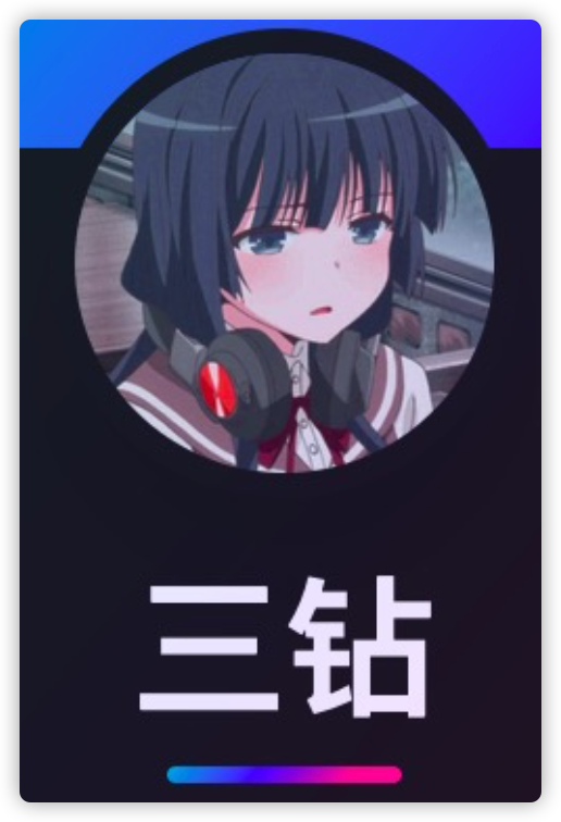 |  | 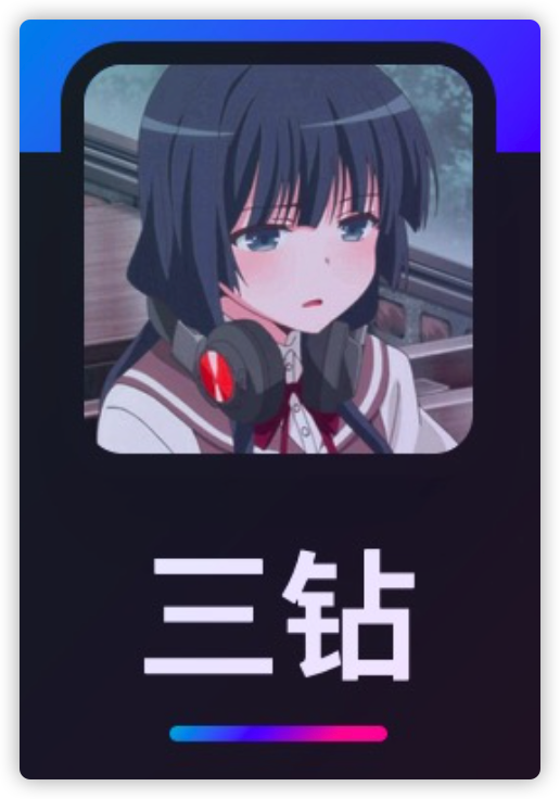 |
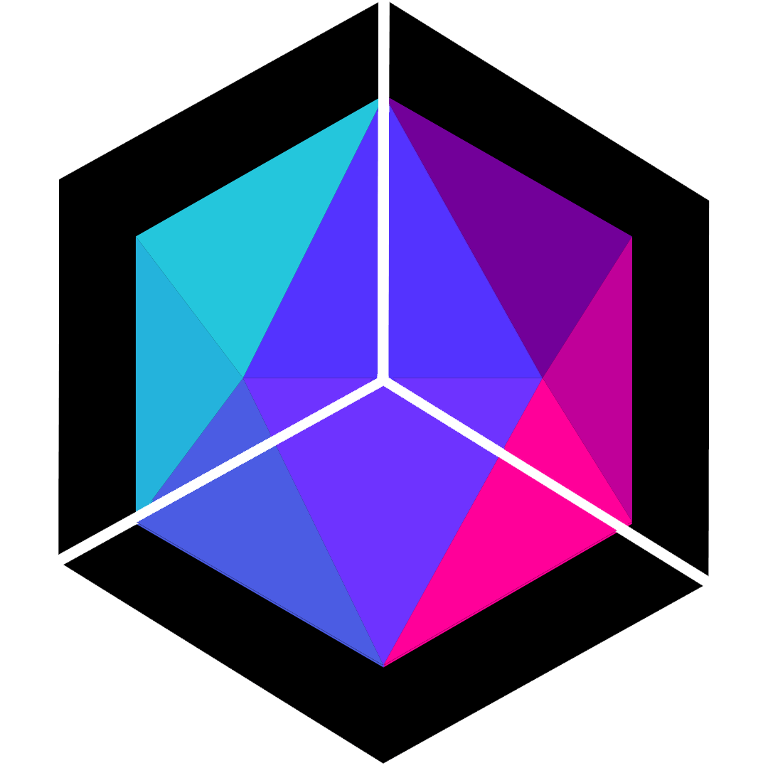
Gradient Colour
A gradient is used across the theme, which consist of 3 main colours. These 3 colours can be configured in the theme option like so:
theme:
# Gradient colors used for the theme
# This consist of 3 gradient colors
# each can be customized
gradient:
color_1: '#24c6dc'
color_2: '#5433ff'
color_3: '#ff0099'theme:
# Gradient colors used for the theme
# This consist of 3 gradient colors
# each can be customized
gradient:
color_1: '#24c6dc'
color_2: '#5433ff'
color_3: '#ff0099'Feature Layout
Feature layout is a section where you display specially selected articles to your visitor on your home page.
This section can display three feature articles at a time. The generation engine will choose the three latest articles that use the feature: true in the Front-Meta of your article markdown file.
By default, the theme will enable feature layout. You can also turn it off using the feature property in your _config.aurora.yml configuration file.
theme:
  dark_mode: true
profile_shape: diamond
feature: truetheme:
dark_mode: true
profile_shape: diamond
feature: trueQuestion
If the feature section will display three feature articles, when I only applied 2 of my articles as feature articles, what will happen?
Good question!, if you applied less than 3 feature articles, the theme generator will pick up the latest articles to fill into the feature sections. It will also make sure it always has 3 feature articles for display!
Question
Oh, I see. Wait!? You said: "Always have 3 feature articles.". What if I only have 2 articles in my blog. Then how are you going to get 3 feature articles?
No worries! The Aurora engine had taken care of that too. If the engine could not get enough articles to fill up to 3 feature articles, the "Feature Layout" will automatically change to Pinned Layout instead.
Pinned Layout
The "Pinned Layout" can be enabled by setting the feature property to false in the _config.aurora.yml configuration file
theme:
  dark_mode: true
  profile_shape: diamond
feature: falsetheme:
dark_mode: true
profile_shape: diamond
feature: falseSetting feature to false will force the theme to use Pinned Layout.
TIP
After changing the feature you will need to re-run hexo cl & hexo g to take effect.
Code Highlight
Aurora now use Shiki as the code highlight engine, for it to work we need to update the highlight and prismjs configs in _config.yml.
highlight:
  enable: false
prismjs:
enable: falsehighlight:
enable: false
prismjs:
enable: falseThen add the new shiki config in your _config.aurora.yml config file.
#! ---------------------------------------------------------------
#! Highlighter Shiki
#! ---------------------------------------------------------------
shiki:
  enable: true
  theme:
  externalTheme:
  backgroundColor: '#1a1a1a'
#! ---------------------------------------------------------------
#! Highlighter Shiki
#! ---------------------------------------------------------------
shiki:
enable: true
theme:
externalTheme:
backgroundColor: '#1a1a1a'Using the provided themes
Choose a theme name from the list below and config it to the theme parameter.
shiki:
  enable: true
  theme: material-theme-palenight
  externalTheme:
backgroundColor: '#1a1a1a'shiki:
enable: true
theme: material-theme-palenight
externalTheme:
backgroundColor: '#1a1a1a'Available default themes:
export type Theme =
  | 'css-variables'
  | 'dark-plus'
  | 'dracula-soft'
  | 'dracula'
  | 'github-dark-dimmed'
  | 'github-dark'
  | 'github-light'
  | 'hc_light'
  | 'light-plus'
  | 'material-theme-darker'
  | 'material-theme-lighter'
  | 'material-theme-ocean'
  | 'material-theme-palenight'
  | 'material-theme'
  | 'min-dark'
  | 'min-light'
  | 'monokai'
  | 'nord'
  | 'one-dark-pro'
  | 'poimandres'
  | 'rose-pine-dawn'
  | 'rose-pine-moon'
  | 'rose-pine'
  | 'slack-dark'
  | 'slack-ochin'
  | 'solarized-dark'
  | 'solarized-light'
  | 'vitesse-dark'
  | 'vitesse-light';
export type Theme =
| 'css-variables'
| 'dark-plus'
| 'dracula-soft'
| 'dracula'
| 'github-dark-dimmed'
| 'github-dark'
| 'github-light'
| 'hc_light'
| 'light-plus'
| 'material-theme-darker'
| 'material-theme-lighter'
| 'material-theme-ocean'
| 'material-theme-palenight'
| 'material-theme'
| 'min-dark'
| 'min-light'
| 'monokai'
| 'nord'
| 'one-dark-pro'
| 'poimandres'
| 'rose-pine-dawn'
| 'rose-pine-moon'
| 'rose-pine'
| 'slack-dark'
| 'slack-ochin'
| 'solarized-dark'
| 'solarized-light'
| 'vitesse-dark'
| 'vitesse-light';Using Custom Themes
If none of above are what you want then you import your own by downloading the theme json file from a Github repo.
For example the VSCode theme I made aurora-future-vscode-theme, this theme can be download from here.
Download the json file and put it in the shiki folder in your blog project root.
. # Hexo project root.
├─ shiki # Shiki theme folder
│  ├─ aurora-future.json # VSCode theme JSON file
├─ _config.yml # Hexo config file.
└─ _config.aurora.yml # Theme config file.
. # Hexo project root.
├─ shiki # Shiki theme folder
│ ├─ aurora-future.json # VSCode theme JSON file
├─ _config.yml # Hexo config file.
└─ _config.aurora.yml # Theme config file.Now adding the theme path to the _config.aurora.yml under shiki config.
shiki:
  enable: true
  theme: aurora-future
  customTheme: '/shiki/aurora-future.json'
backgroundColor: "#1a1a1a"shiki:
enable: true
theme: aurora-future
customTheme: '/shiki/aurora-future.json'
backgroundColor: "#1a1a1a"Custom background color
Themes with Shiki support it's own theme background. But not all the theme background color will goes well with the theme.
By default it is recommended to use #1a1a1a for the Aurora Theme. However if you want to use the default background color from the theme you pick. Just simply remove the backgroundColor config.
shiki:
  enable: true
  theme: aurora-future
  customTheme: '/shiki/aurora-future.json'
backgroundColor: "#1a1a1a" shiki:
enable: true
theme: aurora-future
customTheme: '/shiki/aurora-future.json'
backgroundColor: "#1a1a1a" If you want to use a background color of your own, simply pick a HEX color code that you desire.
shiki:
  enable: true
  theme: aurora-future
  customTheme: '/shiki/aurora-future.json'
backgroundColor: "<color_code_here>"shiki:
enable: true
theme: aurora-future
customTheme: '/shiki/aurora-future.json'
backgroundColor: "<color_code_here>"